Wouldn’t taxi drivers love to know the tip to expect before a taxi passenger gets in?
At the ESRI User Conference last week, members of the InteticsGIS team and SUNY Stony Brook University unveiled a map capable of doing exactly that: predict the amount of tips passengers will leave for taxi drivers. Based on 170 million taxi tip records collected in New York City in 2013, the goal of the researchers was to use this data to predict taxi tipping behavior and use GIS tools to visualize the results. The map received enormous positive feedback throughout the conference. And no wonder. It could change the way we take cabs, but it can also change how we work towards data visualization.
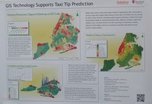
ESRI User Conference is the largest conference for GIS users in the world. This year, InteticsGeo in collaboration with Stony Brook University presented the results of their work that visually shows the distribution and amount of taxi tips in New York City based on ZIP-code. The resulting product includes features such as a geographic visualization of the number of generous tippers by ZIP-code, a map that correlates generous tipping and mean family income, as well as a map exploring the popularity of a particular location by looking at number of trips vs. tip generosity. The map can be used to predict the tips expected based on location and visually organizes the results.

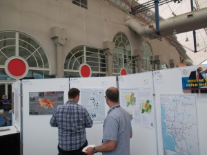
Among a lot of positive feedback, the map received a mention from ESRI CEO Jack Dangermond. The map was displayed in the Gallery of the ESRI conference, where many people complimented the map and investigated it with interest. Many wondered if this is something already in use by taxi companies, while others commended the clarity and simplicity of the layout. Others were interested in the technical aspect of the map, such as how the 3D columns were created and which regression tools were used and how they were incorporated with ESRI’s ArcGIS.
This map is a step in the right direction for collaboration between data scientists and GIS analysts. While both use different technologies, there are many opportunities for effective cooperation. This map combined both data and visual elements with success, and it is living proof that integrating these technologies can lead to relevant and valuable products in the future.
To learn more about the history of GIS in Ukraine, download this white paper.
For more information about the map or the development process of this application, please don’t hesitate to contact us or follow InteticsGeo on Twitter and LinkedIn.
